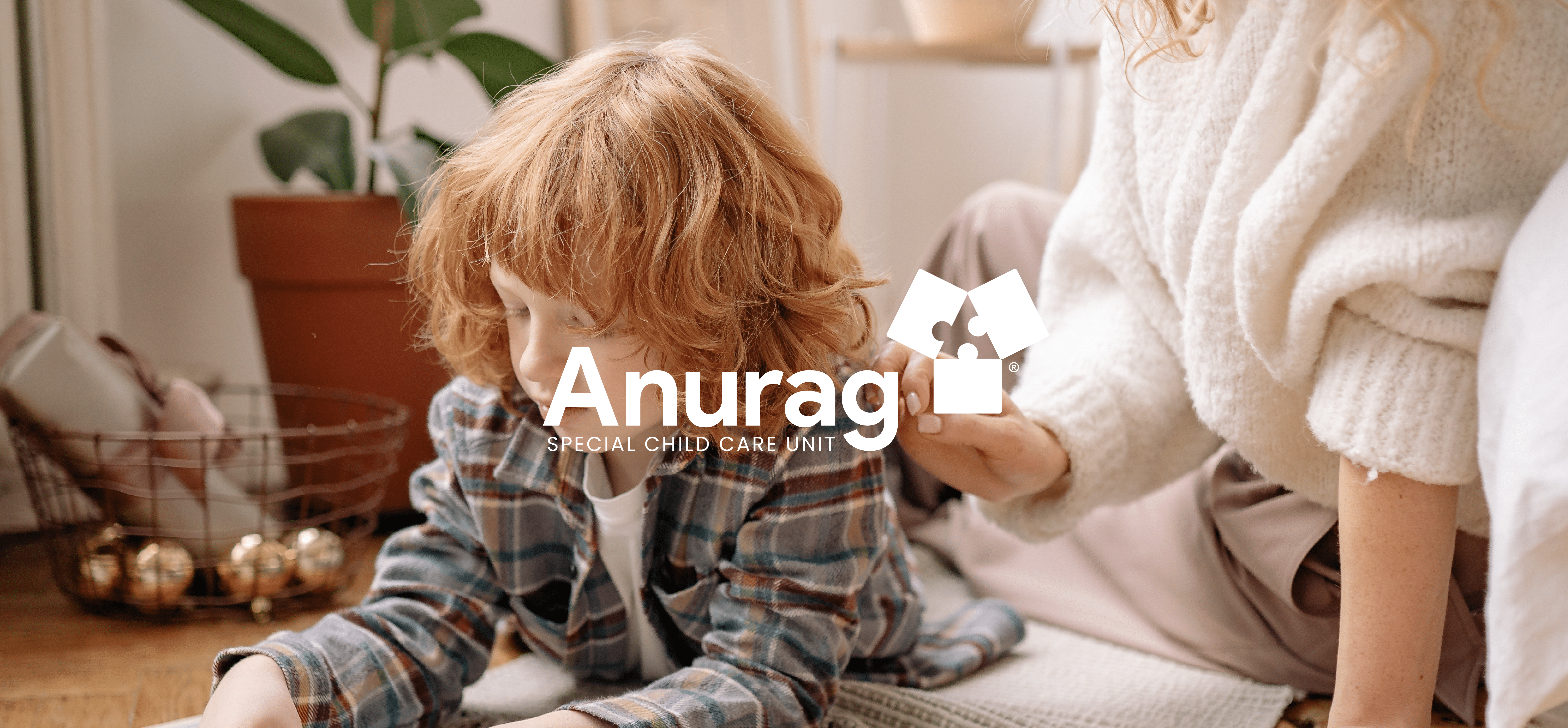
Anurag is a special child care unit that deals with neurological issues such as Autism spectrum disorder that impair the ability to communicate and interact, especially in children. They support the development and learning of a child to reduce symptoms of autism and maximise the child's ability to function.
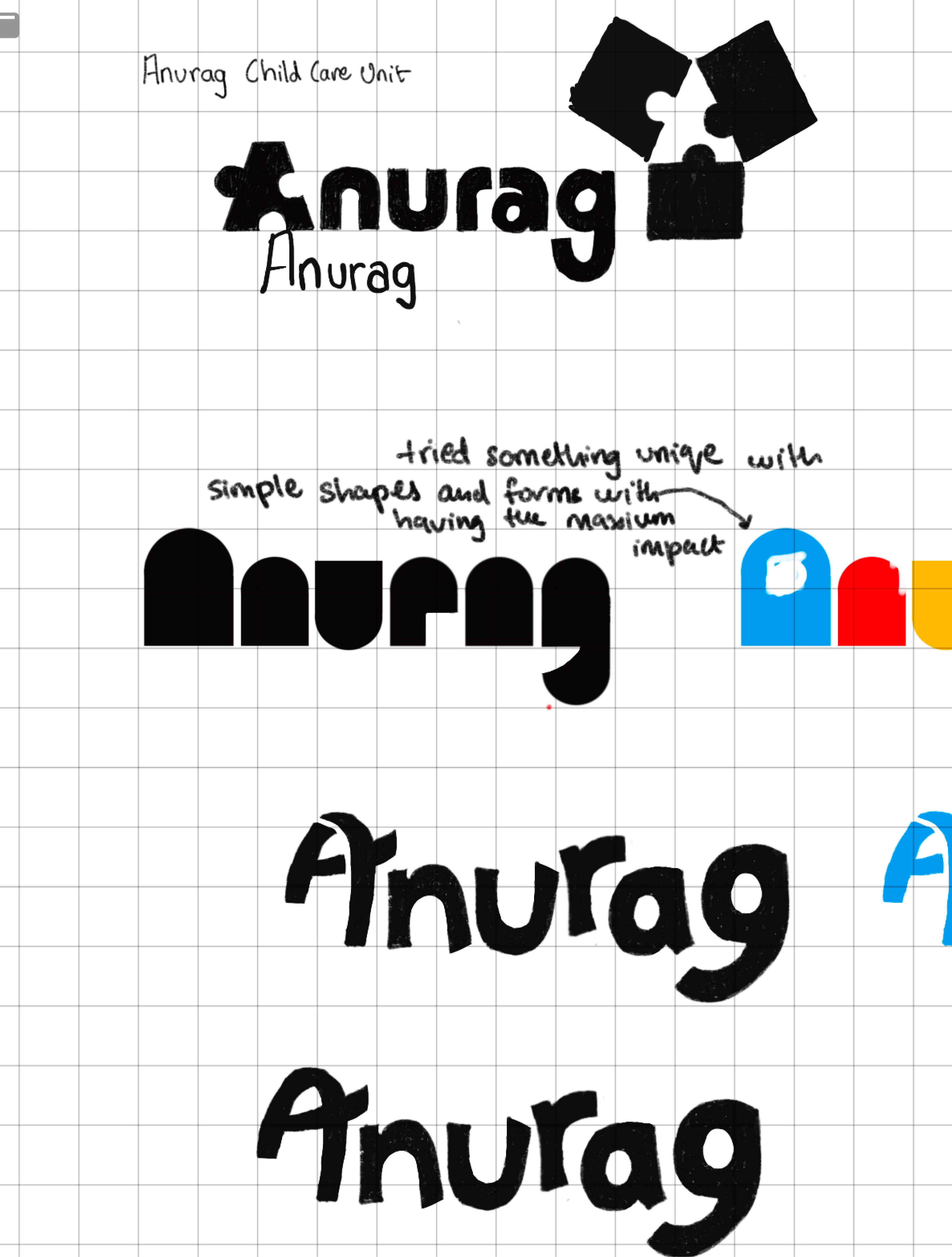
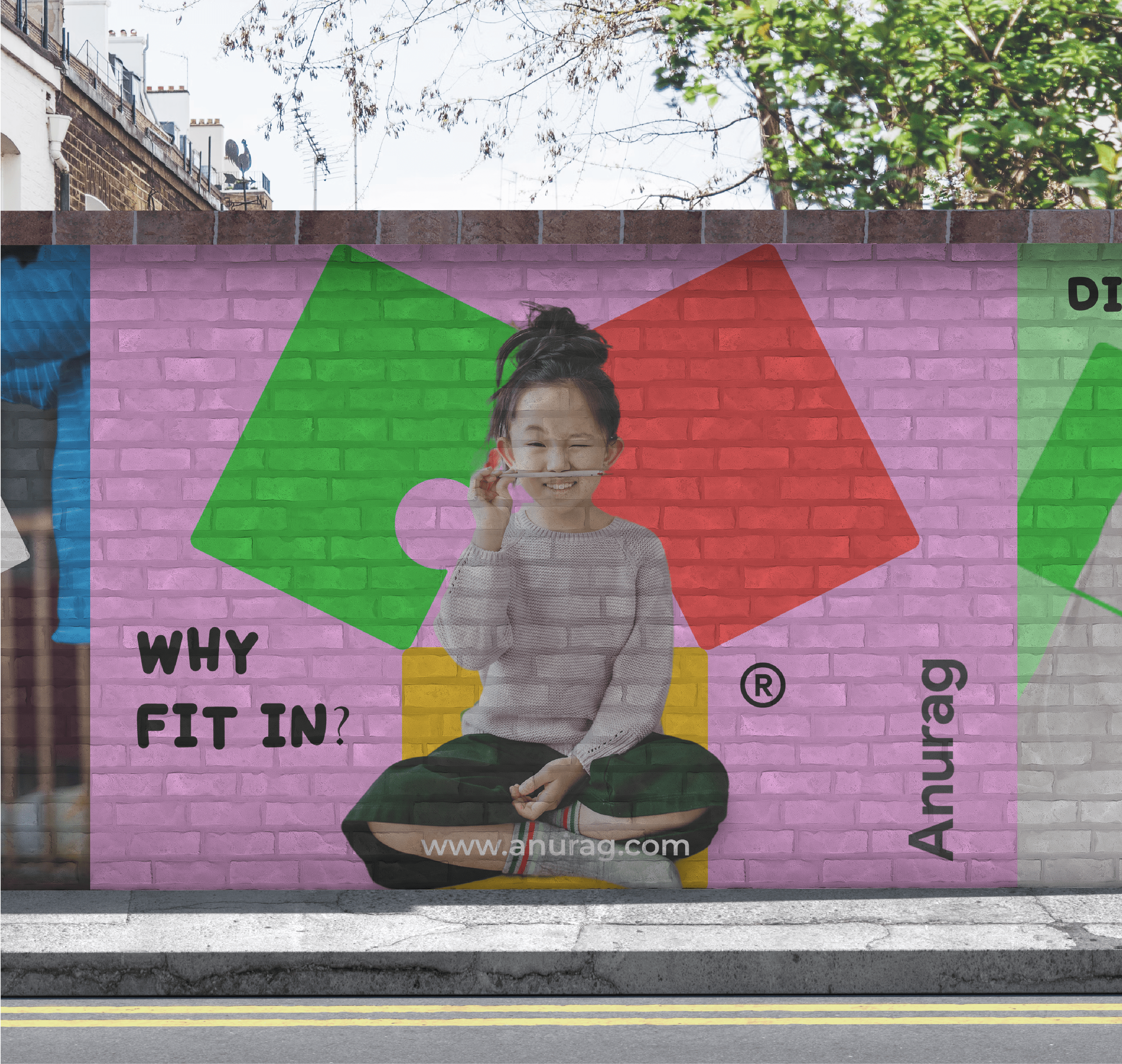
Every child is unique and their ability to process the surroundings is different. One needs to accept this uniqueness. They wanted to depict the uncertainty and uniqueness associated with autism through the Logo and its colours.
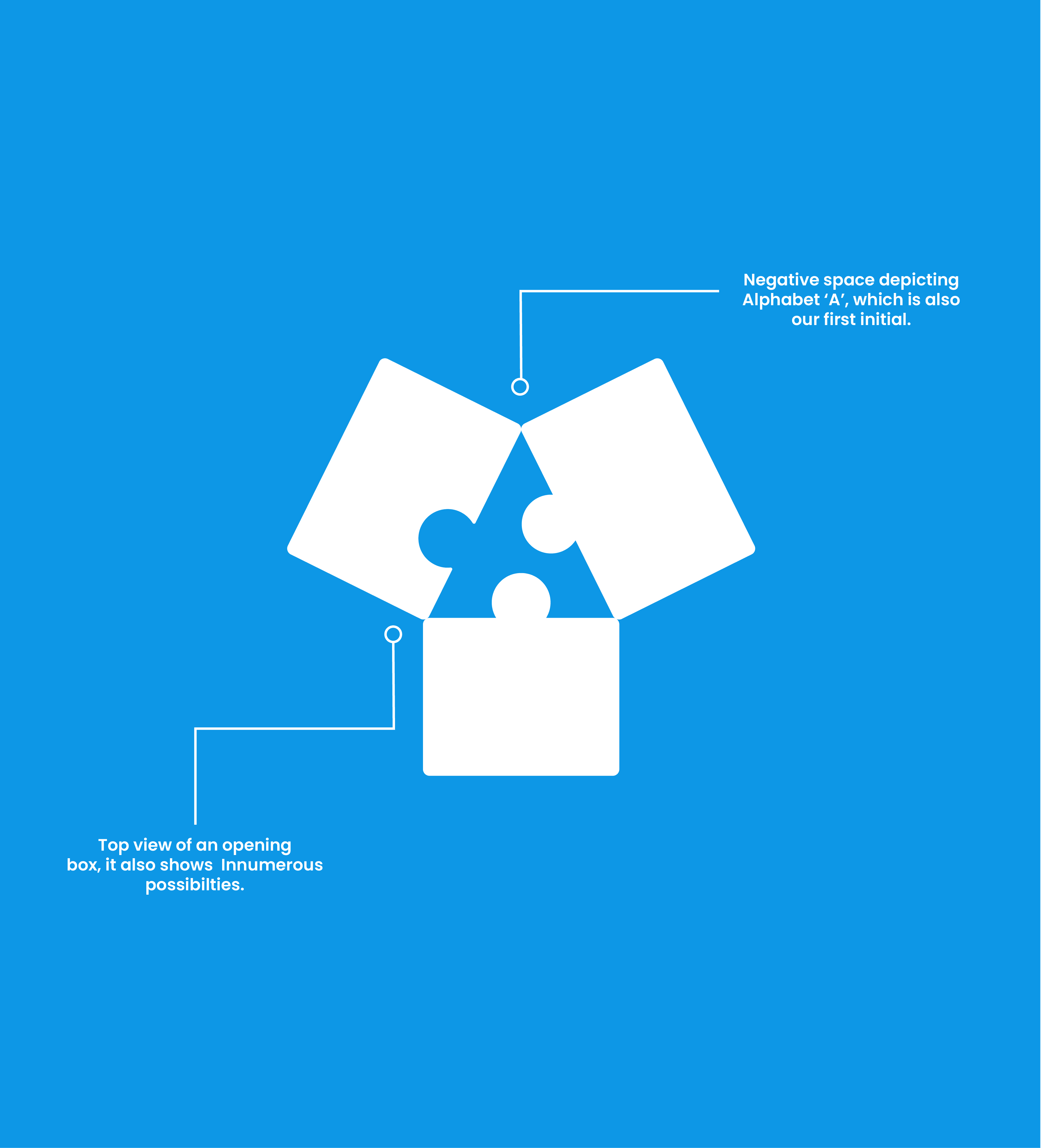
We used an amalgamation of simple geometrical shapes and the word ‘Anurag’ to depict autism by having the maximum possible impact. We tried playing around with different objects and puzzle-like shapes.
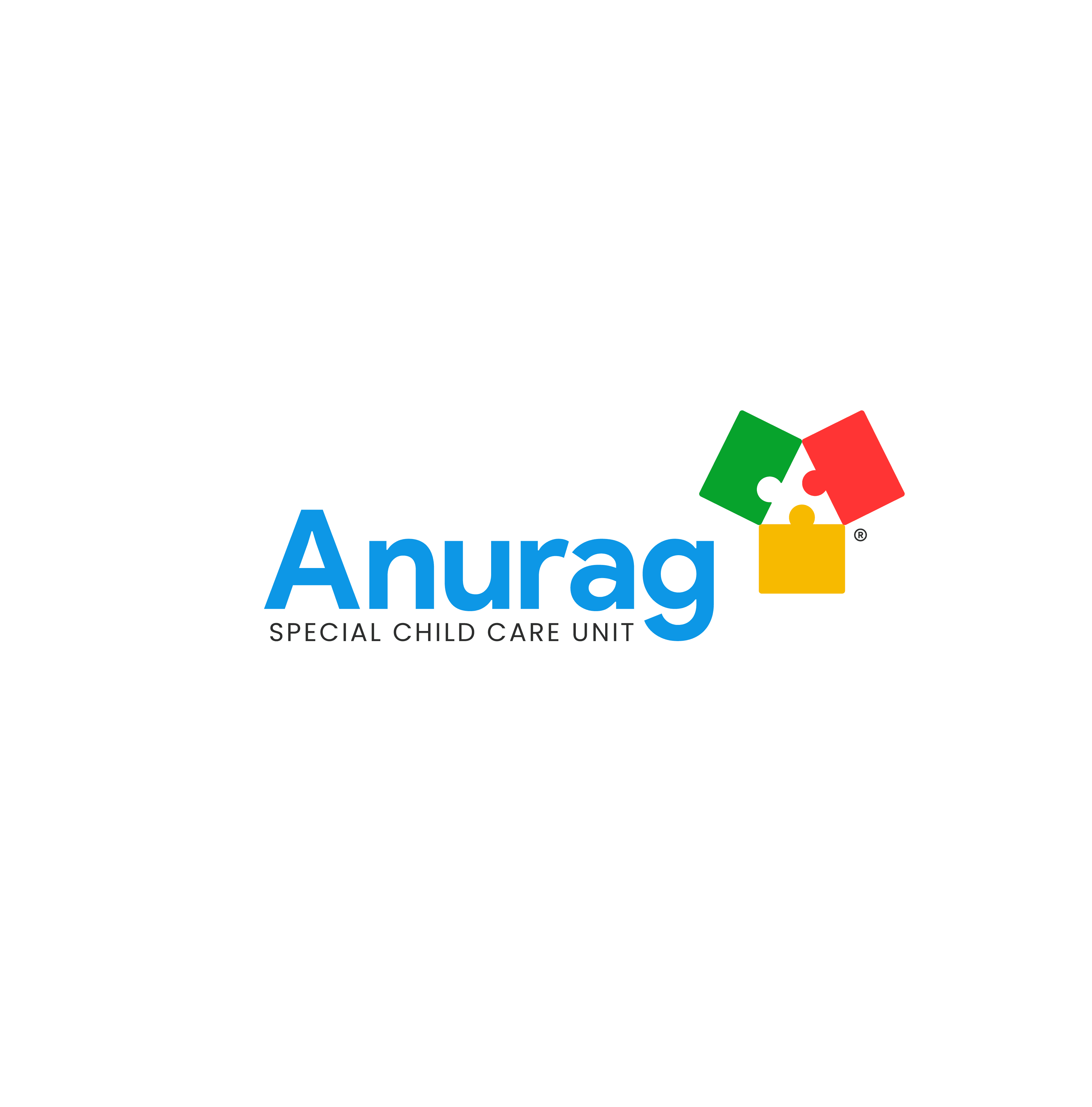
A Logo with three puzzle pieces was finalised with two similar-looking pieces, and the third being different to depict uniqueness. The negative space between the three pieces highlights ‘A’, i.e. the first letter of 'Anurag'. We chose blue, green, red and yellow colours as no single colour can represent autism in its entirety.